In Advertising, Copy Writing, Interaction Design, Off Topic, Web Design Posted February 08, 2013
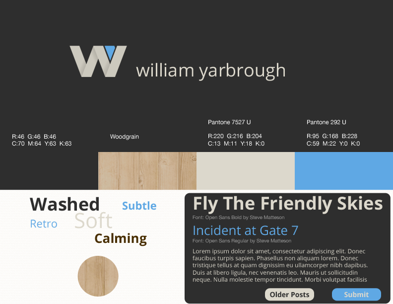
In Advertising, Color, Logo, Marketing, Web Design Posted August 15, 2012
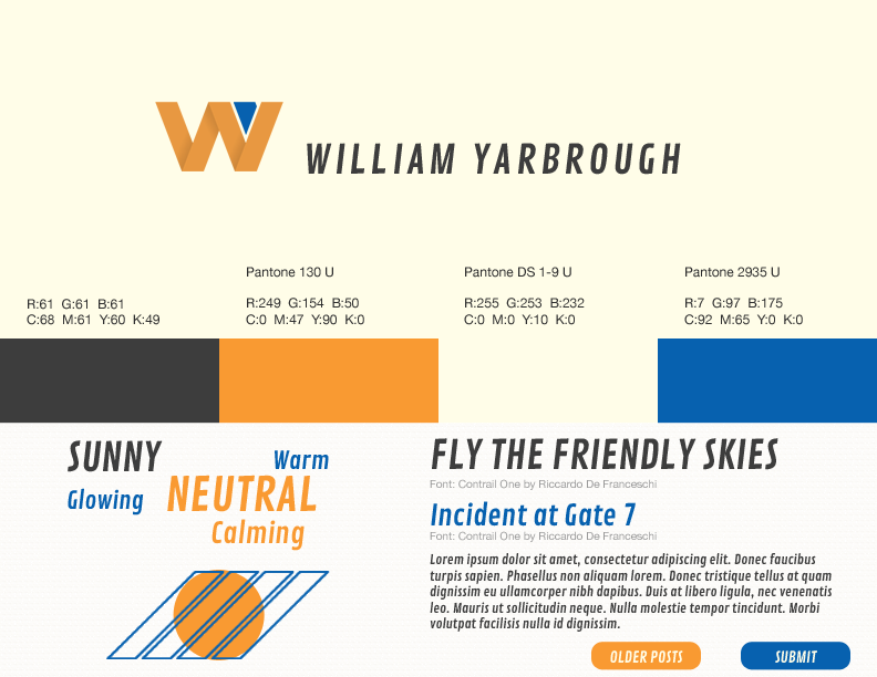
In Advertising, Color, Logo, Marketing, Web Design Posted August 15, 2012
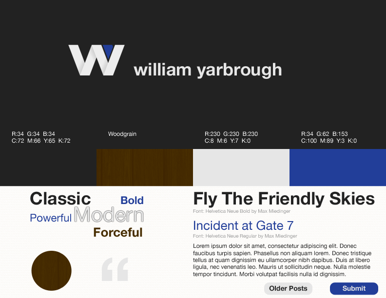
In Advertising, Color, Logo, Marketing, Web Design Posted August 14, 2012
In Advertising, Color, Fashion Posted August 13, 2012
In Advertising, Fashion, User Experience Posted August 12, 2011
In Advertising, Color, Logo, Marketing, Web Design Posted August 11, 2011
In Advertising, Information Architecture, Logo, User Experience, Web Design Posted August 08, 2011
In Advertising, Usability, User Experience, Web Design, Web Development Posted April 20, 2010
In Accessibility, Advertising, Information Architecture, Philosophy, Usability, User Experience, Web Design, Web Development Posted April 10, 2010